Paula and Timo
Each project begins with the couple, the atmosphere, the setting and the overall vision for their celebration.For Paula and Timo, this vision was thoughtfully curated by Katharina and her team, providing a strong and clear foundation for the visual design.
Materials and functionality are central to my process. La Fortaleza combines elegance and nature with an effortless spirit. Paula and Timo are young, refined and have excellent taste. I highlighted that by using natural materials, adding subtle cool accents and keeping the visual language timeless and elegant.
We began with the Save the Dates, printed in soft letterpress on beautiful cotton paper. The cards were tied with a cotton ribbon that added a natural, effortless touch. To complete the set, we created handmade envelopes from a structured blush paper.

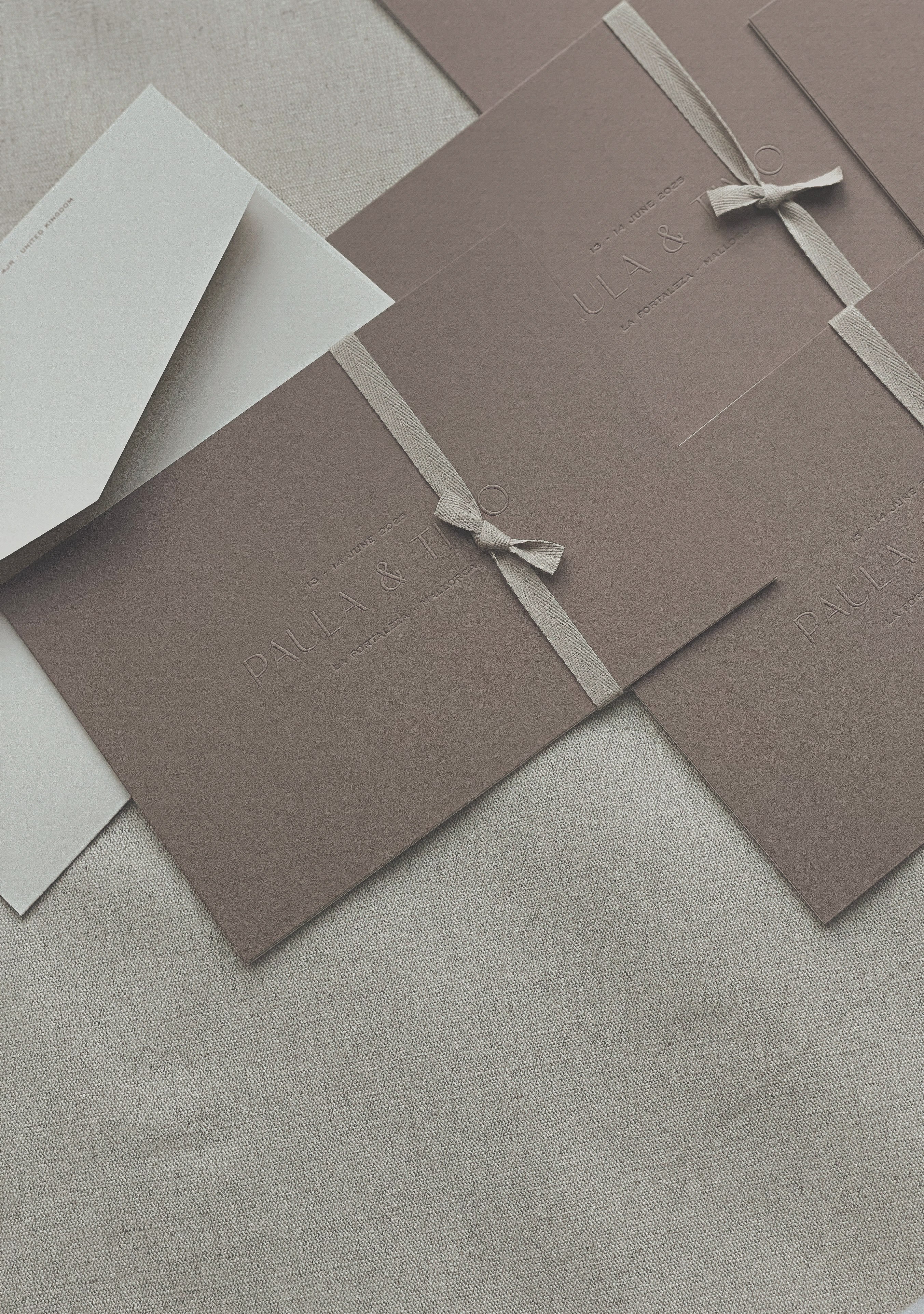
The invitations continued this story but added a bold element: deep mocha paper. The main card featured embossed names and foil letterpress for the date and location. The info cards were printed on blush paper with taupe foil. Everything was tied with the same cotton ribbon and placed in a structured blush envelope.

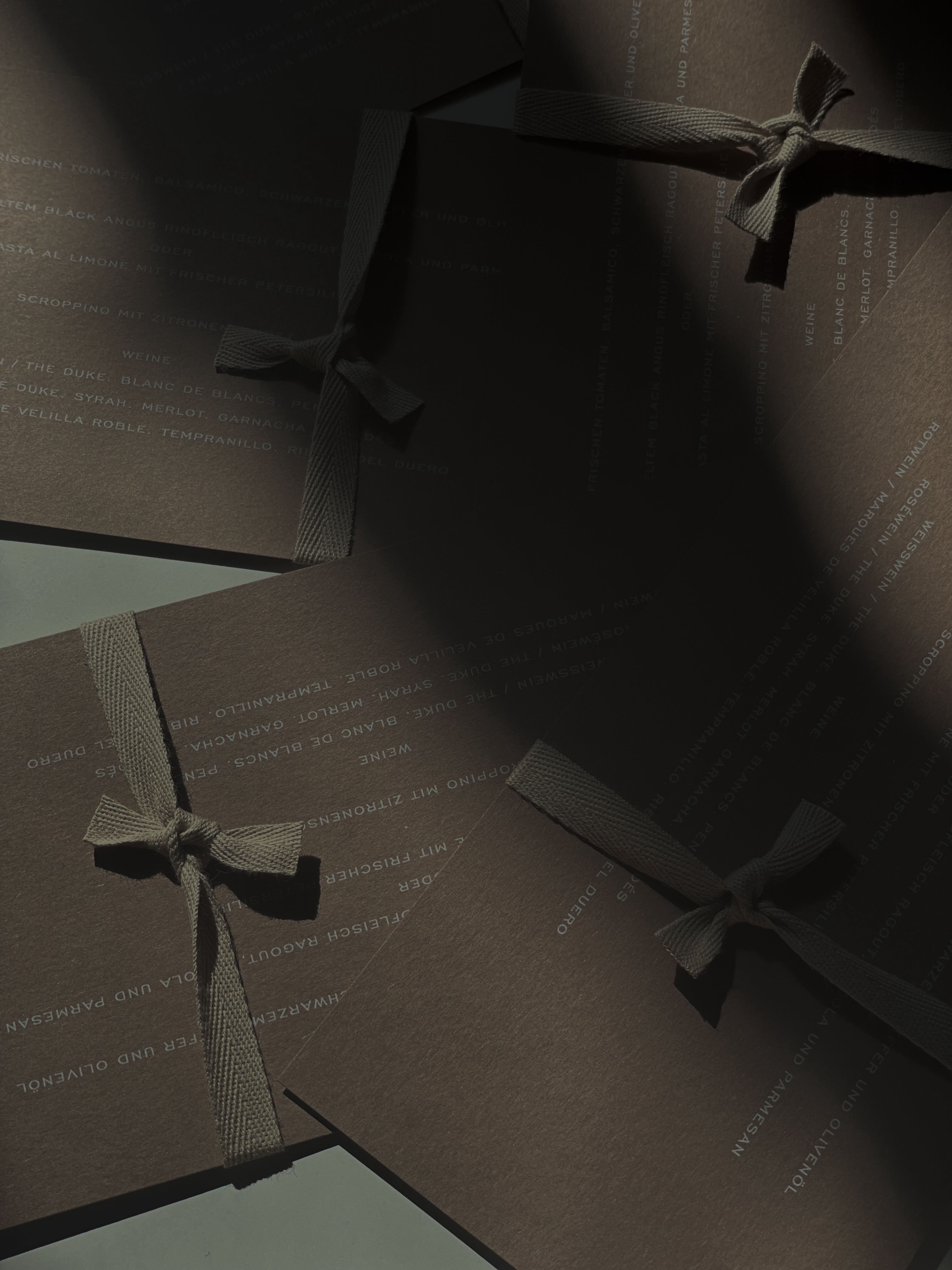
The celebration took place over two days, so we wanted the event stationery to follow the original design but introduce more textures and materials. The first evening, we created a brown welcome sign and bar menus printed on blush paper with delicate embossing, mounted on linen-covered boards. The look remained elegant but gained depth through textures and warm tones. The signs were displayed on custom walnut stands made exclusively for Paula and Timo. Choosing the exact wood tone took a surprising amount of time, but the result felt perfectly balanced. We also designed tapas and drinks menus in the same aesthetic.


The stationery for the wedding day brought together all the materials and colours used before, with one addition: a burgundy tone. The welcome sign was printed on cotton fabric and hung on thick cotton ribbons, which gave it weight and character. It became one of my personal highlights.
I also created personalised calligraphy fans for every female guest, painted in the same burgundy shade as the ribbons.
For the ceremony, we prepared matching reserved signs and a ceremony translation set. Each set was tied with the same ribbon used for the invitations and placed inside personalised envelopes.

The aperitif signage was printed with a subtle emboss on off-white cotton paper, backed with natural linen board and displayed on custom ceramic stands made for this event by our partner ceramic studio. The seating plan for the dinner followed the same materials and was hung on thick burgundy ribbons, echoing the welcome sign.


The menus and place cards became one of our favourite details. Menu was printed on the same paper as the invitations, with white text. Each place card was attached with a cotton ribbon, creating a soft, tactile detail that looked beautiful on the linen napkins and organic tableware. The drinks cards followed the same embossed linen-board style as the rest of the signage.

For the guests, thoughtful details were prepared, including disposable cameras finished with personalised burgundy labels and individual welcome cards.

I worked closely with Katharina and her team and truly enjoyed this collaboration.
The full gallery can be seen in Vogue Germany LINK and on Katharina’s website LINK. I am very grateful to have been part of such a beautiful celebration.
— Aleksandra
the couple Paula & Timo
planning Katharina Landenberger
venue La Fortaleza
photos (fans & Menu) Katharina Raum
Video (wooden) Tu Las
Photos (ceramic) Ronja Ceramics


We take on a limited number of projects each year.
If our work resonates with you, we would be happy to hear from you.
info@wedding-mark.com
